Earth Driven Neutrals Are Taking Over
Cold whites and steely grays have had their run. 2026 brings a shift toward warmer, earth rooted tones think clay, sand, and soil brown. These shades aren’t flashy. They’re grounding. They give space weight and warmth without overwhelming it. The vibe is clean, but not clinical.
Warm minimalism is replacing stark minimalism. Instead of all white rooms that feel like art galleries, we’re seeing interiors that are calm and stripped back, yet still tactile and human. Layering textures like raw wood, soft linen, and stone adds a story to these muted palettes.
It’s about creating organic harmony. These tones easily connect your indoor space with the outside world. They work well in almost any room and play nice with natural light. They also leave just enough room for personal contrast like a rust toned chair or a subtle ceramic glaze.
For deeper inspiration on using these hues effectively, check out these color ideas for interiors.
Deep Greens Make a Bold Return
The green palette is back and this time, it’s got edge. Forest, juniper, and muted olive tones are taking over everything from accent walls to upholstery, offering richness without shouting. These shades strike a solid middle ground: earthy enough to soothe, bold enough to anchor a space.
They shine best in materials with tactile depth like velvet, brushed canvas, or textured paint finishes. A forest green velvet couch doesn’t just sit in the room; it grounds it. Paired with raw wood and matte metals like blackened steel or brushed bronze, these greens play off the natural and the industrial with balance.
If you want contrast without chaos, this is the zone. Deep greens work in both tight spaces and open concept lofts, quietly making a statement while staying easy on the eyes.
Soft Tech: The Rise of Subtle Digital Blues
2026 is dialing back the noise, and nowhere is that clearer than in the quiet rise of cool, desaturated blue tones. These aren’t your punchy teals or loud cobalts they’re softened, pulled back just enough to suggest calm without drifting into cold. Think glacier mist, slate blue, and the subtle shadows of a washed screen.
These blues hit a middle ground. They nod to digital life, but they don’t shout. They’re refined, modern, and adaptable perfect for home offices where focus is king, or kitchens where clean lines meet a clearer mind. They give you space to think.
The best part? They look intentional. Not flashy, not sterile. Just smart, calm, and quietly forward thinking. If you’re building a space to work, reflect, or breathe, this is the palette that won’t get in your way but it will elevate the backdrop.
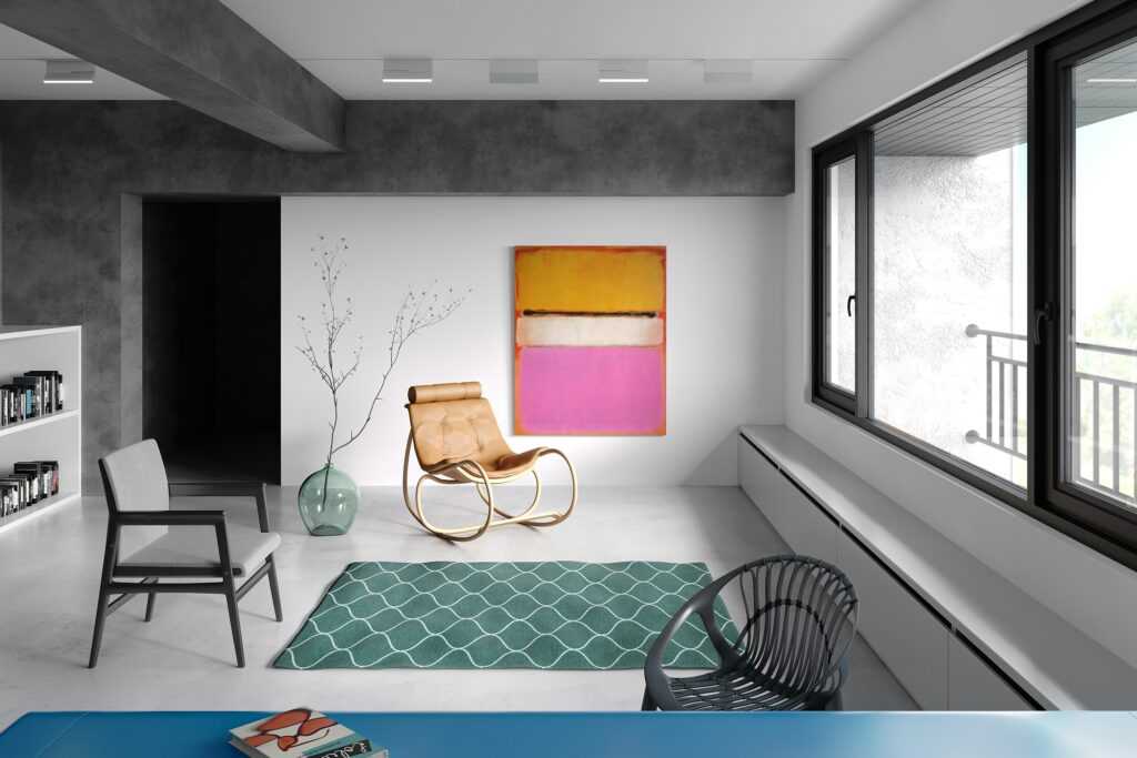
Unexpected Pairings Break the Mold
Color in 2026 isn’t playing it safe. Instead, we’re seeing bold, calculated pairings that push visual boundaries without going overboard. This year is all about controlled contrast mixing intensity and subtlety to redefine what it means for a space to stand out.
Color Combinations Worth Trying
Here are just a few unexpected duos turning heads:
Marigold + Graphite: A daring blend of brightness and depth perfect for energizing living rooms or hallways.
Charcoal + Lavender Haze: Soft meets strong ideal for bedrooms or reading nooks where mood matters.
Where to Use Bold Combos
Not every wall needs wallpaper when strong color pairings do the job. Try these updates:
Statement Ceilings: A dramatic ceiling color adds instant architectural interest without changing structure.
Ombré Walls: Gradient color transitions keep things fluid and modern especially in open concept spaces.
Whether you want a space that speaks softly or makes a bold first impression, these pairings let you do both at the same time.
Color Material Synch Is the Real Secret
Choosing the right paint color is only part of the equation. In 2026, it’s all about how color interacts with texture, material, and form. When carefully synchronized, color and material work together to elevate a space with subtle sophistication and tactile richness.
Pairing Shades with Tactile Match Ups
Bring dimension and warmth by aligning hues with materials that enhance their natural feel:
Clay toned fabrics for cozy, grounded palettes
Mossy ceramics that add greens in natural, organic ways
Raw linens and matte woods that tone down brights while offering texture
These combinations help colors feel rooted, rather than artificial or out of place.
Let Saturation and Reflection Work Together
In modern interiors, light behaves just like color it shapes perception. Coordinating the saturation level of your color palette with surfaces that reflect or absorb light makes a big impact.
Use low sheen paints in soft light rooms to deepen tone
Combine highly saturated shades with matte finishes for an elegant, non flashy statement
Opt for patinated metals or rough stone to reflect color in unexpected ways
Ready to Play?
The best part of this trend is how flexible and experimental it can be. To start mixing and layering confidently, explore more ideas here: color ideas for interiors
Finish Strong with Matte Luxe
Gloss is taking a step back in 2026. This year, it’s all about finishes that don’t shout. Matte leads the way quiet, grounded, and rich in texture. Whether you’re drawn to the dusky boldness of smoked plum, the earthy edge of terracotta, or a deep rust red, matte helps these colors hold space without overpowering it.
In rooms with soft lighting or moody corners, matte brings out warmth instead of glare. It plays especially well in layered interiors think walls that fade into velvet drapes or lived in leather. The goal isn’t to dazzle. The goal is to envelop. Matte surfaces give color weight, texture, and a kind of quiet strength that gloss simply can’t.
This isn’t about playing it safe it’s about staying confident without needing attention.
Make Colors Personal
Trend forecasts can spark ideas, but they’re not commandments. At the end of the day, your space has to serve you not someone else’s Pinterest board. What looks stylish in a magazine might fall flat under your lighting or clash with your rhythm at home. Instead of chasing color fads, pay attention to how a hue behaves in the room throughout the day. Morning light, shadow lines, or even the texture of your furniture can make the same mustard yellow feel cozy or jarring.
Matching your palette to your lifestyle is a smarter move. That means leaning into colors that work when you’re half asleep at 7am or entertaining friends at 9pm. Maybe your home office needs calming softness, while the kitchen gets bolder flashes that wake you up.
Pick colors you won’t get sick of. Those are the ones that quietly hold the room together. Forget temporary flash. Go for lived in comfort you want to come home to every single day.
 Williams Unruhandieser is the kind of writer who genuinely cannot publish something without checking it twice. Maybe three times. They came to home efficiency hacks through years of hands-on work rather than theory, which means the things they writes about — Home Efficiency Hacks, Interior Design Styles and Trends, Living Space Concepts and Innovations, among other areas — are things they has actually tested, questioned, and revised opinions on more than once.
That shows in the work. Williams's pieces tend to go a level deeper than most. Not in a way that becomes unreadable, but in a way that makes you realize you'd been missing something important. They has a habit of finding the detail that everybody else glosses over and making it the center of the story — which sounds simple, but takes a rare combination of curiosity and patience to pull off consistently. The writing never feels rushed. It feels like someone who sat with the subject long enough to actually understand it.
Outside of specific topics, what Williams cares about most is whether the reader walks away with something useful. Not impressed. Not entertained. Useful. That's a harder bar to clear than it sounds, and they clears it more often than not — which is why readers tend to remember Williams's articles long after they've forgotten the headline.
Williams Unruhandieser is the kind of writer who genuinely cannot publish something without checking it twice. Maybe three times. They came to home efficiency hacks through years of hands-on work rather than theory, which means the things they writes about — Home Efficiency Hacks, Interior Design Styles and Trends, Living Space Concepts and Innovations, among other areas — are things they has actually tested, questioned, and revised opinions on more than once.
That shows in the work. Williams's pieces tend to go a level deeper than most. Not in a way that becomes unreadable, but in a way that makes you realize you'd been missing something important. They has a habit of finding the detail that everybody else glosses over and making it the center of the story — which sounds simple, but takes a rare combination of curiosity and patience to pull off consistently. The writing never feels rushed. It feels like someone who sat with the subject long enough to actually understand it.
Outside of specific topics, what Williams cares about most is whether the reader walks away with something useful. Not impressed. Not entertained. Useful. That's a harder bar to clear than it sounds, and they clears it more often than not — which is why readers tend to remember Williams's articles long after they've forgotten the headline.