What a Highlight Can Actually Do
A highlight isn’t just a bold colored accent wall. It’s any intentional visual that draws the eye lighting that adds drama, textures that invite touch, or artwork that creates narrative. Done right, a highlight becomes the quiet hero of a space, anchoring everything around it.
When you highlight with purpose, you do more than decorate you control mood, scale, and movement. That soft floor lamp in the corner? It elongates a cramped room. A strip of wood paneling? Warms up a sterile wall. Highlights create rhythm and depth, making rooms feel curated instead of thrown together.
You don’t need to overhaul the whole house. Start with areas people actually use and see entryways, reading corners, kitchen backsplashes, the empty stretch behind the bed. These are high return zones where a simple change shifts the entire vibe.
Case Study 1: From Flat to Fabulous with Color
Before: A Space Without Contrast
Many homes start here walls painted in neutral tones, décor in soft beiges or greys, and little contrast throughout. The result? A space that feels calm but uninspired. Without defined zones or variation in hue, the room lacks visual direction and emotional warmth.
Neutral walls and flooring throughout
Minimal contrast between furniture and finishes
A monotone palette that washes out features
After: Deliberate Color Adds Definition
With the introduction of intentional color zones and layered hues, the transformation is immediate and striking. No major renovation just smart color placement.
Accent colors define different functions within an open space (reading nook, dining area, etc.)
Layered tones add depth think warm rust with pale pink, or navy paired with soft gray
Colored trims or painted alcoves pull the eye and create a natural sense of flow
Why It Works: Flow Through Color
These selective color highlights do more than decorate they guide movement and draw attention to architectural features. Walls once ignored now contribute to the atmosphere of the room.
Creates visual transitions in open plan spaces
Adds personality without clutter
Enhances perceived scale when colors are placed strategically
Explore color highlight techniques to learn how subtle shifts in paint and palette can redefine your living space.
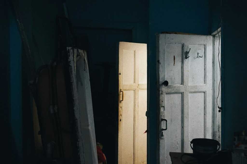
Case Study 2: Natural Light, Finally Put to Work
Before: Underused and Dim
Many homes have natural light sources that go unnoticed or poorly utilized. In this case, the room suffered from:
Dark corners that made the space feel smaller
Heavy window treatments that blocked sunlight
A lack of surfaces that could reflect and distribute available light
The result? A dreary, compressed feeling even on sunny days.
After: Reflective Choices That Expanded the Room
The transformation centered around making the most of the light that was already there. With a few strategic updates, the entire space felt brighter and more open:
Mid sheen paints were chosen to subtly bounce light without producing glare
Reflective décor think mirrors, metallic frames, and ceramic accents was used to scatter natural light into darker zones
Window treatments were swapped for light filtering fabrics that let in daylight while maintaining privacy
Why It Works
Light enhancing highlights do more than brighten a space they alter how we perceive its size and energy. When used thoughtfully:
Reflective surfaces and finishes create greater depth and openness
Strategic placement can channel natural light into previously dim corners
The overall atmosphere feels more inviting and expansive
These small tweaks made a big difference proving you don’t need to knock down walls to maximize a room’s potential.
Case Study 3: Textures That Tell a Story

This space started out as a textbook example of playing it too safe blank walls, uniform paint, and matched furniture that flattened everything into one big blur. It wasn’t broken, but it was bland.
The fix wasn’t structural or expensive. It was tactile. Introducing contrast textures think rough stone beside soft velvet, or a matte wall against a glossy cabinet added immediate dimension. The room now catches light and interest in all the right places.
Swapping in a woven throw, a plush rug, or paneled wall section was enough to pull the eye and set depth. No need to gut the room. Just give it something to say. Texture speaks louder than you’d think.
Case Study 4: Turning a Wall Into a Focal Point
Before the transformation, the wall was just dead space too big, too bare, and way too easy to ignore. It didn’t give the room anything to work with. No rhythm. No personality. Just a void that made the whole area feel unfinished.
After the makeover, it became the anchor. A clean layout of feature art gave the wall structure. Gallery lighting sharpened the mood and put intentional focus where it counts. Colored trim added depth and framed the entire display, making the wall feel purposeful, not accidental.
Why does it work? Scale and proportion. Large walls demand balance, and you have to place elements that assert themselves without overwhelming. Hierarchy keeps the eye moving your viewer should know what comes first, what supports it, and what rests quietly in the background.
Design wise, it’s not about throwing things up until it looks interesting. It’s about choosing the right things, spacing them right, and giving them room to breathe. That’s how you turn a wall from blank to bold, without tipping into chaos.
How to Highlight Your Own Space Like a Pro
Bold doesn’t always mean loud. The most impactful highlights use light and color in tandem bouncing warm tones off natural sunlight or layering cool hues under soft lamp glow. It’s about building mood through subtle contrasts, not overpowering the room.
Stick to a palette. That’s your foundation. But don’t be afraid to explore the range within it. Play with tones. Mix flat and gloss. Contrast textures inside the same hue family. What matters is cohesion, not repetition.
Start with a small canvas. A single hallway, a compact reading nook, or even one set of shelves. These tight zones give you room to experiment without committing to a room wide overhaul. And they’re a great testing ground for lighting tricks and tone layering.
Not sure where to begin? Find some practical ideas in our guide to color highlight techniques.
Bonus: Mistakes Worth Avoiding
Highlighting has impact when used with restraint. But when everything’s trying to stand out, nothing really does. Over highlighting is a common trap. If every wall has a statement color, every corner a bold accent, and every light blares for attention, the space loses hierarchy and becomes visual noise. Choose your moments and let other elements breathe.
Then there’s the everyday stuff people forget: outlets, cable lines, and sightlines. That eye catching LED strip? Doesn’t work if your power source is in the wrong place. That gorgeous art wall? Useless if blocked by a cabinet. Designing highlights requires a basic grip on the physical realities of the room what wears out, what gets moved, what needs maintenance.
Finally, lighting changes everything and it’s rarely static. Natural light evolves hour by hour. A color that looks soft in morning sun might glow like neon at night. Before committing, test your highlight plans across conditions. A little patience now saves a lot of regret later.
 Williams Unruhandieser is the kind of writer who genuinely cannot publish something without checking it twice. Maybe three times. They came to home efficiency hacks through years of hands-on work rather than theory, which means the things they writes about — Home Efficiency Hacks, Interior Design Styles and Trends, Living Space Concepts and Innovations, among other areas — are things they has actually tested, questioned, and revised opinions on more than once.
That shows in the work. Williams's pieces tend to go a level deeper than most. Not in a way that becomes unreadable, but in a way that makes you realize you'd been missing something important. They has a habit of finding the detail that everybody else glosses over and making it the center of the story — which sounds simple, but takes a rare combination of curiosity and patience to pull off consistently. The writing never feels rushed. It feels like someone who sat with the subject long enough to actually understand it.
Outside of specific topics, what Williams cares about most is whether the reader walks away with something useful. Not impressed. Not entertained. Useful. That's a harder bar to clear than it sounds, and they clears it more often than not — which is why readers tend to remember Williams's articles long after they've forgotten the headline.
Williams Unruhandieser is the kind of writer who genuinely cannot publish something without checking it twice. Maybe three times. They came to home efficiency hacks through years of hands-on work rather than theory, which means the things they writes about — Home Efficiency Hacks, Interior Design Styles and Trends, Living Space Concepts and Innovations, among other areas — are things they has actually tested, questioned, and revised opinions on more than once.
That shows in the work. Williams's pieces tend to go a level deeper than most. Not in a way that becomes unreadable, but in a way that makes you realize you'd been missing something important. They has a habit of finding the detail that everybody else glosses over and making it the center of the story — which sounds simple, but takes a rare combination of curiosity and patience to pull off consistently. The writing never feels rushed. It feels like someone who sat with the subject long enough to actually understand it.
Outside of specific topics, what Williams cares about most is whether the reader walks away with something useful. Not impressed. Not entertained. Useful. That's a harder bar to clear than it sounds, and they clears it more often than not — which is why readers tend to remember Williams's articles long after they've forgotten the headline.