Earthy Neutrals Still Reign
Warm taupes, soft beiges, and rich browns aren’t going anywhere they’re just getting more refined. These grounded tones continue to dominate interiors heading into 2026 because they do the heavy lifting quietly: they anchor a space without overwhelming it. Paired right, they’re anything but boring.
Light clay and sandstone are stepping up, too. They walk that tightrope between warmth and minimalism, keeping things cozy without tipping into sterile territory. It’s the kind of palette that invites you in and holds up over time.
The big idea here? Nature is the muse. Designers are pulling from soil, stone, and sun bleached wood to help homes feel calm, lived in, and enduring. It’s less about trend chasing, more about creating a space that breathes. These colors aren’t just aesthetically chill they’re built for staying power.
Deep Greens and Botanical Blues
In 2026, we’re seeing a shift toward grounded, saturated hues that bring nature inside without screaming for attention. Forest green and eucalyptus are becoming go to choices, not just as accents but across full walls, cabinetry, and even furniture. They’re bold but rooted, bringing a calm depth that works in both modern and traditional settings.
Navy and teal aren’t going anywhere either, but they’re evolving. The blues of now have subtle gray undertones that soften their presence still moody, but not icy. Together, these shades carry emotional weight without overwhelming a space.
These deeper tones are right at home in Japandi interiors and other biophilic inspired designs. They play well with natural woods, stone, and soft textures. It’s about atmosphere, not drama.
For more on how these hues support function and calm, see How Japandi Style Blends Serenity and Function.
Terracotta’s Modern Makeover
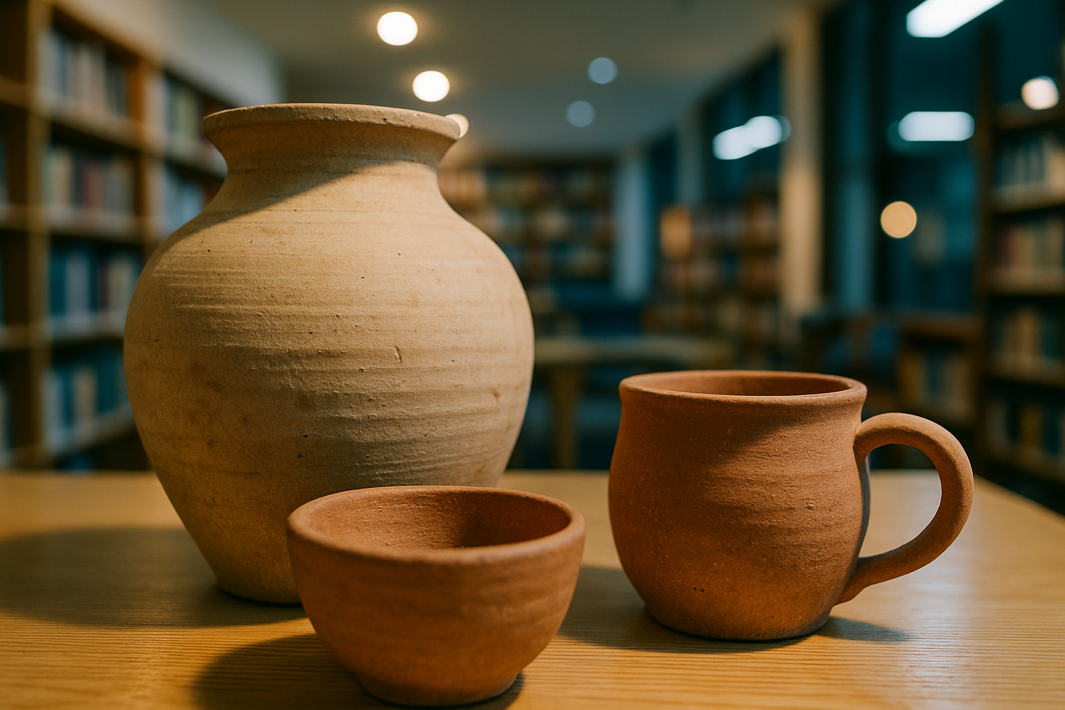
Once considered a hallmark of rustic and traditional interiors, terracotta is undergoing a transformation for 2026. This earthy hue is being reimagined with soft rosy undertones and refined finishes that blend warmth with modern elegance.
A Contemporary Twist on a Classic
Rosy undertones bring warmth while making terracotta feel fresher and more versatile.
Satin finishes add a subtle sheen, elevating terracotta beyond its traditional matte roots.
The result is a color that feels grounded but sophisticated perfect for updated, minimal aesthetics.
Balanced Pairings
Designers are deliberately pairing terracotta with cooler tones to achieve visual balance:
Cool slates and graphite grays create a sleek contrast without overwhelming the space.
Soft whites keep the palette feeling airy and bright, allowing terracotta to shine as a focal point.
A Bold Anchor for Minimalist Interiors
Far from feeling overpowering, this modern terracotta works as a grounding element:
Acts as a visual anchor in otherwise light and neutral rooms.
Complements natural materials like oak, linen, and clay.
Adds warmth and character, particularly in open, minimalist settings where every design element matters.
Terracotta in 2026 is more than just a color it’s a design statement that bridges comfort, sophistication, and timeless appeal.
High Contrast Black and White Returns (With a Twist)
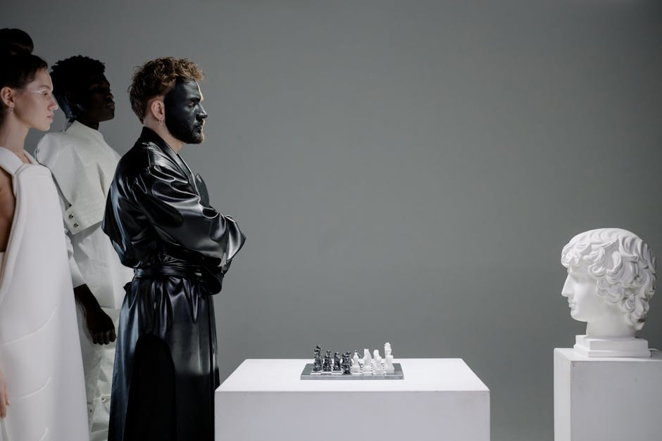
Monochrome is back, but it’s maturing. The stark black and white interiors of the past are giving way to something more livable: softer edges, less glare, more tactility. Instead of clean, hard lines and ultra bright whites, designers are leaning on off whites and deep charcoals to give contrast without chaos.
This reinterpretation is less about shouting and more about whispering with strength. It’s all in the details matte black fixtures, warm white walls with a hint of cream, and plenty of layered materials. Textures like rough stone, smooth plaster, and chalky paint finishes keep the palette from feeling clinical. In a word: grounded.
This shift gives black and white schemes new longevity. They stay bold, but feel more human less showroom, more sanctuary.
Serene Pastels With Edge
Lilac gray, pale sage, and muted peach aren’t your average pastels. They’re soft without being timid tones with just enough weight to carry a room, not disappear in it. These colors are showing up in built ins, window trims, and accent paneling, where they quietly frame a space without yelling for attention.
Designers are using these hues to carve out personal corners within a room reading alcoves, work nooks, or moments of calm in otherwise busy layouts. Think of them as color therapy you can live inside. They give warmth, invite light, and support the kind of low key flow that modern interiors are leaning toward.
The bigger trend? Wellness. These shades are part of a larger movement toward human centered design interiors that feel restorative rather than reactive. They’re not trendy for the sake of it. They’re a quiet rebellion against overstimulation, offering design that exudes calm without sacrificing character.
What This Means in Practice
Color in 2026 isn’t loud, and it’s not trying to be. The trends are signaling a craving for calm, honesty, and lasting relevance. People aren’t just painting walls they’re setting a tone. One rooted in wellness, simplicity, and emotional depth.
The emerging palette is doing a lot with a little. It’s flexible enough to evolve with your tastes but considered enough to hold its ground. These aren’t colors that will feel dated in two years. They’re chosen for their staying power and adaptability, working across design styles, lighting conditions, and architectural moods.
Whether you’ve got full scale renovation plans or just need to make a single room feel more like you, these hues punch above their weight. They’re more than trendy they’re built to last.
