The Mood Behind the Hues
Color has always done more than fill space. In 2026, it’s being asked to do something deeper carry weight, inspire calm, reflect intention. Interiors are finally catching up to the idea that color isn’t just decorative; it’s functional. The right shade shifts how a room feels and how people move through it. Cool grays slow the pace. Sun drenched amber sparks conversation. Deep green restores a bit of balance in overstimulated spaces.
What’s different now is the pivot away from color for color’s sake. Instead of high gloss trend chasing, people are tuning into shades that feel right with their personal rhythms. A softer neutrality might work better in homes where quiet focus matters. A blur of citrus tones might land in spaces where energy is the assignment. Designers are guiding choices less with opinion and more with intuition, mood, and daily habits.
The palettes for 2026 are less locked in and more layered. Expect to see emotional range in every project: warm earth tones paired with surprising digital pastels, or rich jewel accents grounded by desaturated walls. No more one size fits all schemes. Just smart, responsive design that listens first, then colors in.
Spotlight on 2026’s Dominant Color Stories
In 2026, the palette has taken a turn familiar tones are being reshaped, and unusual pairings are gaining ground. It’s less about loud dominance, more about quiet intention.
Earth tones aren’t going anywhere, but they’ve evolved. Think less generic beige and more depth: rich clay with a hint of red, ochre that leans golden without going full mustard, and olive that goes surprisingly neutral depending on the room’s light. These shades anchor a space without muting it.
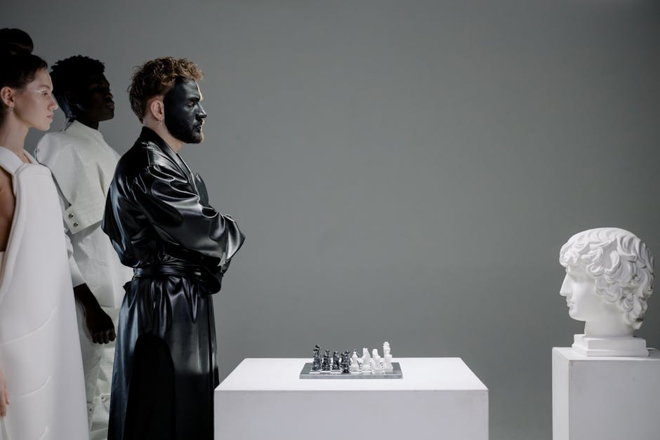
Contrast, though, is having its moment. Designers are playing with matte black grainy, grounded and hitting it hard against citrus neon. It’s a stark, deliberate clash that speaks more to statement making than settling in.
Then there’s the coastal revival, but it’s not sea glass and anchors. Desaturated blues inspired by overcast shorelines, and sun washed corals that feel gently faded, not bubblegum bright. It’s breezy but not beachy, coastal without the cliché.
And perhaps the most unexpected twist this year? Muted tech pastels. Soft lilacs, digital friendly baby blues, and grey infused lavender tones that borrow from interface design but feel comfortable in a lived space. These colors have quietly crossed into home interiors from app design boards and startup branding and somehow, they work.
This year’s color narrative isn’t strictly bold or soft it lives in the tension between. That balance is what’s keeping things interesting.
Function Meets Color
Color has moved beyond decoration it’s now a functional design strategy.
Whether you’re defining a home office within a living room or encouraging calm in a busy household, purposeful color use can shape flow, zones, and behavior in a space.
Zoning with Color in Open Spaces
Open concept living is here to stay, but it comes with the challenge of defining areas without physical dividers. Color provides a seamless solution.
Painted zones: Use area specific hues to delineate spaces like dining, lounging, or working.
Accent walls vs. color blocking: Choose subtle shifts or bold contrasts depending on the energy you want each area to evoke.
Floor to ceiling strategy: Extend color through furniture, rugs, and light fixtures for a unified sense of place.
Color Coding for Productivity and Relaxation
Color psychology plays a significant role in how we interact with interior environments. Smart color choices can differentiate between high focus and low stimulation zones.
Warm neutrals and greens: Ideal for calm, meditative areas like bedrooms and reading nooks.
Pale blues or subtle yellows: Boost focus in work zones without overstimulating.
Avoid harsh contrast in relaxation areas: Softer gradations reduce visual noise and encourage rest.
Paint vs. Material Pigment: Where Color Lives Best
While paint is the most flexible medium for introducing color, it’s not always the only or best option depending on the space and permanence desired.
Paint: Great for walls, ceilings, and spaces needing occasional refresh.
Materials with inherent pigment: Stone, tile, terrazzo, or dyed concrete introduce depth and texture alongside hue.
Fabrics and finishes: Textiles and wood stains allow nuanced layering or experimentation without permanence.
Function and color are no longer separate decisions. When used wisely, color anchors a room’s role and enhances how people feel and interact within it.
How Designers Are Using Color as a Narrative Tool

Designers today aren’t just picking colors they’re crafting scenes room by room. Each space tells its own story, and color is doing the heavy lifting. A deep navy in a study signals focus and formality. A dusty rose in the bedroom softens the mood. The idea is to treat each room like a chapter, and your palette is the voice.
Saturation and finish are critical tools in that storytelling. High gloss crimson in a dining area feels bold and kinetic great for setting an energetic tone over dinner. A matte sage in a bathroom? It relaxes and grounds. The texture of a surface adds just as much meaning as the hue. Contrast isn’t just visual it’s emotional.
Then there’s lighting, the wild card. The same color can shift entirely between sunny morning light and soft evening lamps. That’s why top designers test palettes at different times of day and under various bulbs. Warm toned lighting pulls out richer undertones; cool light brings crispness. Color can’t be separated from the environment around it smart design embraces that reality.
In 2026, color isn’t decoration. It’s dynamic, atmospheric, and deeply personal. Layer wisely. Light intentionally. Let the room speak.
Pairing Trends with Timeless Tones
Color trends come and go some sprint through a season, others hang around long enough to feel like staples. The trick is learning to spot the difference. Dusty lilac? Probably transitional. Acid green? Probably temporary. Understanding this distinction saves time, money, and a weekend of repainting walls you suddenly can’t stand.
Leaning into trends doesn’t mean going all in. Use bold, of the moment tones as accents: cushion covers, artwork, a feature wall if you’re feeling brave. Let those pieces evolve with the times. Keep the bones of your space neutral or grounded in a palette that’s proven its staying power think soft taupes, forest greens, navy, and off whites. These hues don’t argue with newer colors; they give them room to be interesting.
A future proof palette isn’t about playing it safe. It’s about blending personality with flexibility. Character doesn’t have to get sacrificed for longevity. It just needs smarter layering. Pick one or two current shades you connect with, then integrate them through textures or shapes that add dimension even after the color cools off. That’s how you stay stylish without becoming a slave to the next color drop.
Go Deeper into Design Forecasting
Color’s only part of the story. The interiors world is shifting faster, more focused, and more function driven than before. Materials, layout strategy, and even scent mapping are entering the design conversation for 2026. Biophilic elements are no longer nice to haves they’re baseline expectations. Smart home tech is being styled, not just installed. And customization is the new luxury, from modular furniture to bespoke storage solutions.
To see how these shifts go beyond just paint and pigment, check out the full forecast: 2026 Interior Design Trends You Shouldn’t Miss. It’s a dense look lean and direct at what’s really reshaping how we live inside.
Practical Tips for Homeowners and Designers
When it comes to color, shortcuts usually lead to long term regrets. If there’s one rule: always sample. But don’t just slap one square on a wall and call it a day. Test multiple swatches, in different lighting, on multiple walls. Morning light versus late afternoon can make a coral look soft one minute and loud the next. Let samples sit for a few days. Live with them. It saves both time and second guessing.
On the sustainability front, water based, low VOC paints aren’t just hype anymore they’re standard among forward thinking designers. Natural pigments and plant based dyes are also gaining traction, even in mass market lines. These options aren’t just gentler on the planet; they also reduce indoor air pollution and tend to age better on walls.
As for whether to DIY or call in help, it comes down to the scope and the stakes. If you’re color blocking an accent nook or refreshing a home office, do it yourself. It’s low risk, and you’ll learn a lot. But for full interiors or colors that interact in complex spaces multi surface rooms, odd lighting, or mixing textures bring in a pro. Color consultants see things most people miss. And in 2026, where subtlety and layers matter more than ever, an expert eye can make or break the end result.


